

NAMÃSTEY

Identidade da Marca - Design de Logotipo
Fui contactado pelo responsável desta start-up, que precisava de um logótipo concebido para representar o seu negócio. Como já havia algumas ideias que o proprietário tinha e sabia o que queria, foi fácil começar a desenhar para mim. O logotipo básico incluía tipografia, o que significava que eu era capaz de fazer o design principal em apenas alguns dias sem problemas.
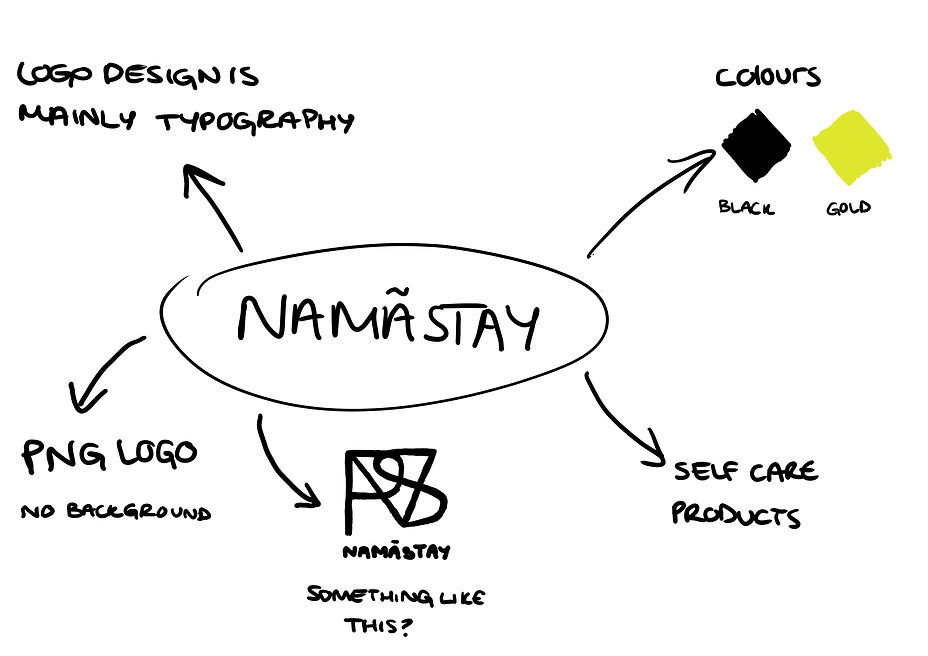
Durante o processo de revisão, enviei de volta os designs do logotipo e tive que fazer alguns ajustes no design para que ele se adequasse às necessidades do proprietário. Naturalmente, este foi o processo mais difícil, pois tive que fazer pequenos ajustes e mudanças cada vez que era verificado, pois às vezes havia algo fora do lugar, ou a cor não estava certa ou o design não parecia bom.
During the revisions process, I sent back the logo designs and had to make some tweaks to the design so that it would fit the needs of the owner. Naturally, this was the most difficult process as I had to make little tweaks and changes each time it was checked as sometimes there would be something out of place, or the colour wasn't right or the design didn't look good.
I sent these logo designs back for review but the design still did not look or final. I got some feedback afterwards instructing me to change these mistakes that are shown above with circles. The first mistake was that the 'V' and the 'S' had to be joined together. I went back and tweaked the line on the 'V' so it can join together with the edge of the 'S'. The second mistake was purely a spelling mistake. I fixed this by taking out the 'A' and replacing it with an 'E', however, now I needed to make it in the style of the other letters so that it matched. I did this by taking out the vertical line from the letter leaving only the three horizontal lines. I felt like that now matched the modern style of the logo and now the mistakes were covered.
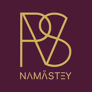
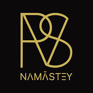
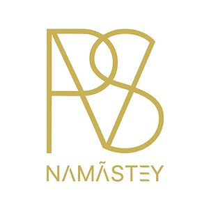
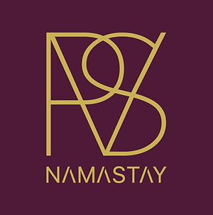
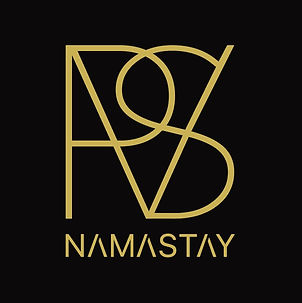
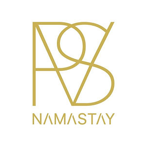
Acima está o design final do logotipo para NAMASTEY. Acho que ficou ótimo porque atendeu a todos os critérios que o cliente queria para a identidade da marca. A única coisa era adicionar um acento em uma das letras. Eu enviei o logotipo final em uma versão PNG e algumas versões JPEG que tinham três cores de fundo diferentes. Junto com o design do logotipo, eu fiz uma maquete de cartão de visita para mostrar o logotipo.

A marca está suspensa por enquanto, pois os produtos ainda estão sendo trabalhados, mas o logotipo foi finalizado e sua página no Instagram está funcionando para que você possa conferi-los lá.