

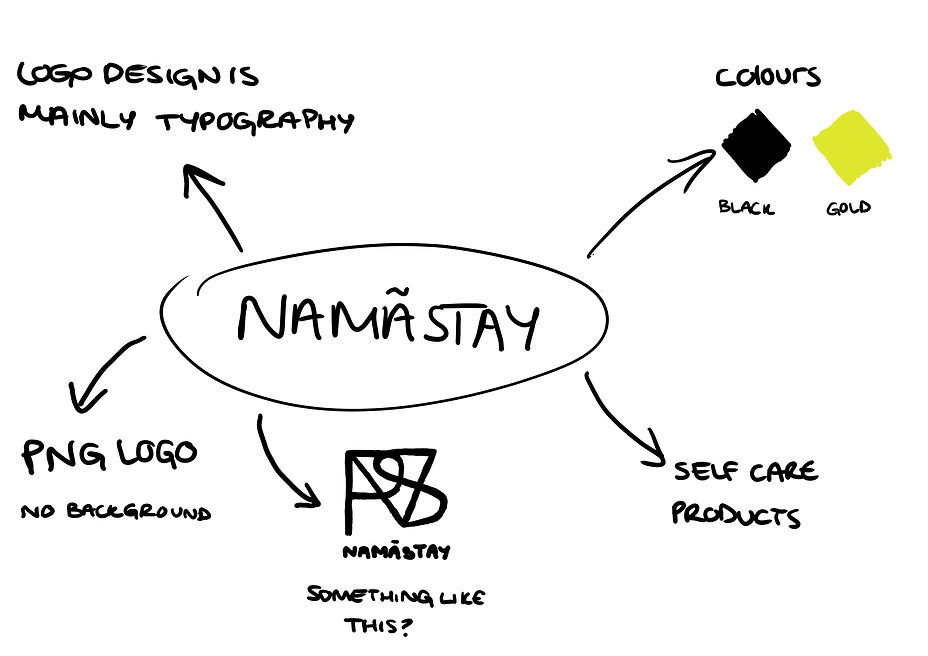
NAMÃSTEY

Brand Identity - Logo Design
I was contacted by the head of this start-up business, who needed a logo designed to represent their business. Since there were already some ideas that the owner had and knew what they wanted, it was easy to start designing for me. The basic logo included typography which meant that I was able to get the main design done in just a few days without any problems.
During the revisions process, I sent back the logo designs and had to make some tweaks to the design so that it would fit the needs of the owner. Naturally, this was the most difficult process as I had to make little tweaks and changes each time it was checked as sometimes there would be something out of place, or the colour wasn't right or the design didn't look good.
During the revisions process, I sent back the logo designs and had to make some tweaks to the design so that it would fit the needs of the owner. Naturally, this was the most difficult process as I had to make little tweaks and changes each time it was checked as sometimes there would be something out of place, or the colour wasn't right or the design didn't look good.
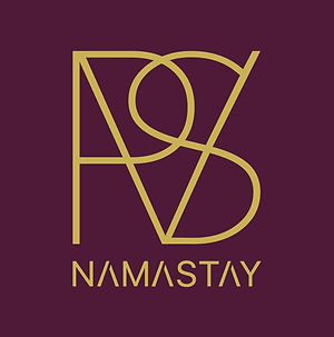
I sent these logo designs back for review but the design still did not look or final. I got some feedback afterwards instructing me to change these mistakes that are shown above with circles. The first mistake was that the 'V' and the 'S' had to be joined together. I went back and tweaked the line on the 'V' so it can join together with the edge of the 'S'. The second mistake was purely a spelling mistake. I fixed this by taking out the 'A' and replacing it with an 'E', however, now I needed to make it in the style of the other letters so that it matched. I did this by taking out the vertical line from the letter leaving only the three horizontal lines. I felt like that now matched the modern style of the logo and now the mistakes were covered.
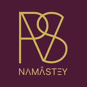
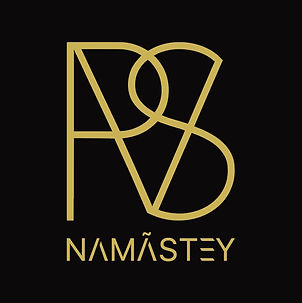
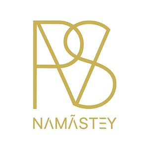
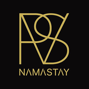
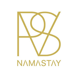
Above is the final logo design for NAMASTEY. I think it turned out great because it met all of the criteria that the client wanted for the brand identity. The only thing was to add an accent on one of the letters. I sent over the final logo in a PNG version and a couple of JPEG versions which had three different background colours. Along with the logo design, I made a business card mock-up to show off the logo.

The brand is on hold for now as the products are still being worked on but the logo has been finalised and their Instagram page is up and running so you can check them out on there.