Mendhi By SM
Brand Identity - Logo Re-Design
I was contacted by one of my friends who was contacted by the owner of the business. When I got pitched the client's project brief during a group call, I jumped at the opportunity to work on this project to gain some more experience working on creating logos. Although this project was fairly easy as it was just a re-design, I had to start all over with creating this logo as the original logo was pixelated and unclear to the eye.
the back of the business card had a simple design and a normal layout, it had the contact details of the owner on one side and the other had the logo.
BACK
FRONT
this is the original business card design, front and back, I was instructed to keep the original business card design, so I kept the changes minimal.
After the briefing, I started working straight away so so I don't lose any time, so I started by looking and analysing the old business card and knew that I was going to have to re-do everything. I started working on the logo design first as that was the most important aspect of the business card and the business. I zoomed into the front of the business card and began to remake the logo carefully, first I worked on creating the outer border that went around the text, for this I used the pen tool from Adobe Illustrator. I went over the square on the business card using the tracing method so I could get accurate results when making the lines. I created the floral pattern on Photoshop using the paintbrush tool so I can accurately draw the flower for a detailed rendition of the original.

painted floral pattern
rotated square

final border design
When I completed these two assets, I joined the two together and was able to replicate part of the original logo design. The next part of the logo was creating the typography. I tried to replicate the typeface as accurately as possible, so I started hunting for different 'serif' style typefaces so I can keep the feel of the original logo typeface in the redesign of the logo.

typeface : Minion Variable Concept
style : Display Bold
used pen tool to create the letters
After searching through different typefaces in the 'serif' styles, I found the one that was a close match to the original and was able to accurately match the design of the original business card. After replicating the text along with the sizing, I centred the text and got almost an exact match and was happy with the final design of the second part of the logo redesign. After this, I was able to bring all the redesign assets together and got an exact match from the original logo design. After I joined the assets together the logo looked even better than the original as this was a redesign.
textual part of the logo

visual part of the logo
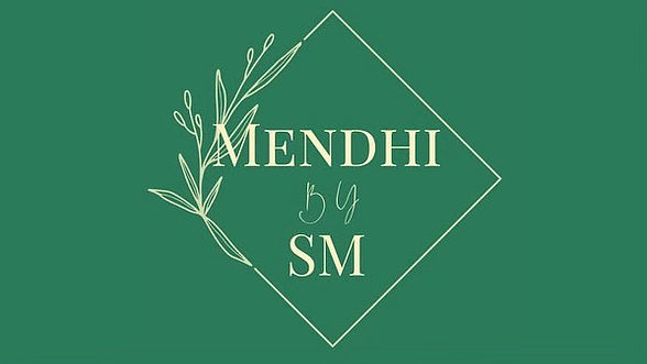
Below is the final redesign of the original logo. The brief was to recreate the business card but because the logo was in the business card, it was also hard to make out the logo because the resolution of the business card was too low and it was becoming unclear. That is why I took the decision to redesign the logo too and then work on the business card. After this I started working on the redesign of the business card.

FINAL REDESIGN OF LOGO :
I used the same colour scheme as the original business card which was a certain tone of a dark green. The secondary colour was like a light chalk yellow and I found that both of these colours complimented each other well. These were the two main colours that I used and was happy because they were authentic to the business and business card and I did not want to interrupt the brief.
Dark Green
#2B7B5B
Custard Yellow
#F5F6C7
The redesign of the business card was fairly easily because I had the original business card's JPEG with me that I received from the client. The only thing I had to work out was the size of the business card because I was not told what size the client wanted specifically. So what I did is set the document size to the default business card size which was 85mm by 55mm. I used this size to as the document size and decided to start redesigning the business card. I was able to add the primary colour which was the dark green tone as the background of the business card and this is the authentic colour that was on the original business card.
55 millimetres
85 millimetres
2x artboards
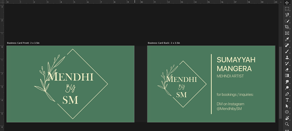
I created two artboards, one for the front and back of the business card. On the first artboard, I added the redesigned version of the logo on top of the background to replicate the original front face of the business card. I had to enlarge the logo so it can be visible and also centred the logo. This was a simplistic design and layout for the business card and I did not want to change the layout as I was happy with the front face of the card.
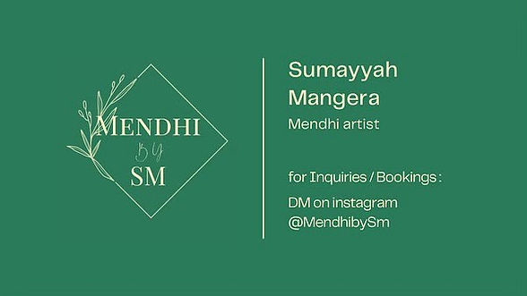
The second artboard contained the design for the back face of the business card, it was pretty much the same as the original, however, there were some subtle changes as I was not happy with the layout and typography choices made in the design of the original card. Naturally, I decided to find a typeface that was modern and can be viewed a bit clearer. I chose a simple typeface which was 'SF UI Display'. This is one of my favourite typefaces and it does the job well as well as having different styles. Sticking to the original design and layout, I added the logo on the left side but decreased the size to fit more information in on the right hand side of the card. On the original card, the information on the card was in lowercase therefore I decided to add some contrast and made the name and job title in uppercase as it is the most important information and my intention was to draw the reader to the name and job title first staying true to the design hierarchy. Underneath that, I left some space and added the contact information, since this business operates mainly through the use of social media, I added the Instagram handle so readers and potential clients know where to find the business and get into contact with the owner.
back face redesign
front face redesign
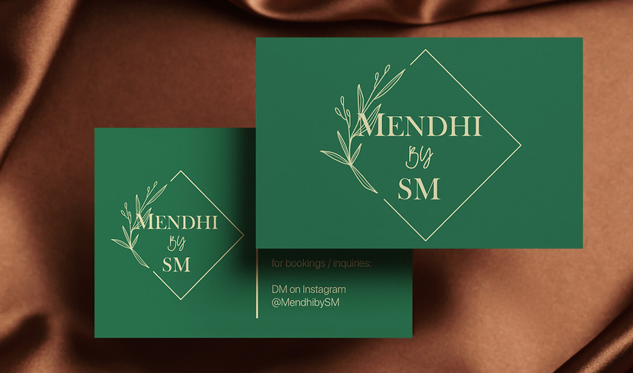
After making the last checks with all aspects of the design, I was finally happy with the final design of the logo and the business card. For the final touch I was able to create some mock-ups to display the business card in a professional way and the mock-up design came out good.
Here is the final mock-up to display the business card :
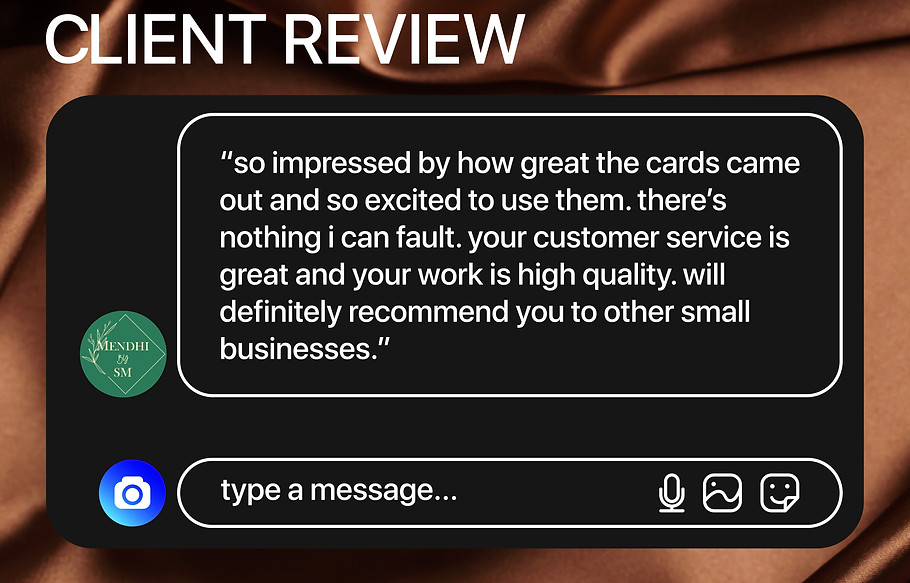
After I completed the project and handed it back to the client, I was happy with the way everything turned out, to add to this, I got some feedback from the client which is always nice when it is positive feedback.