


Crane's Eye Magazine
Art Direction

For this project, we had to create a magazine on Brick Lane. From it's history, to the culture and the cuisine, I researched all the different aspects of what makes Brick Lane so plentiful and diverse. I had to makes sure to cover all the things about Brick Lane so that tourists can understand the history and culture of this part of London.


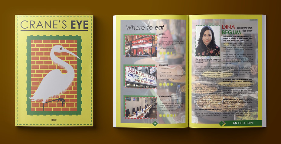
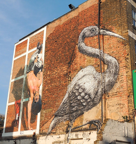
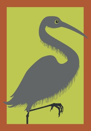
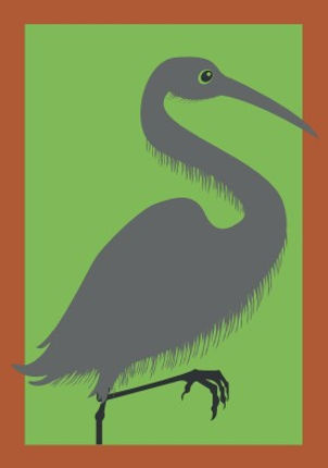
After carrying out the research on the different aspects of Brick Lane, I had to come up with some ideas on how to structure and layout the front cover as that was the most important part of the magazine. I listed down some ideas that I thought were good ideas and were inspired mostly by the street art in Brick Lane. I came across the crane mural on google images and found that crane inspirational and something that people can find relatable because when they see a rendition of the mural they would think of Brick Lane and this was what I wanted my front cover to be inspired by. I also found that the Brick Lane street sign was pretty good looking because it lets the reader know that this magazine is about Brick Lane so they might be interested in giving it a read and so I had made a vectorised style of the street sign and implemented that into the magazine's back cover, this made the magazine cover design more interesting as the cover was now continuous.

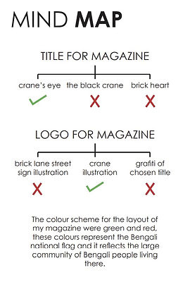
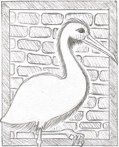
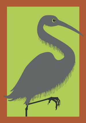
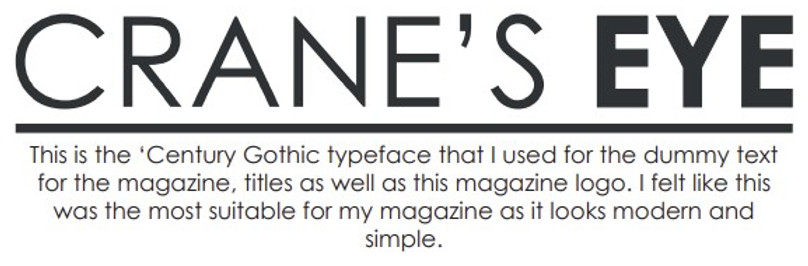
The next thing was working on a title for the magazine rather than a logo because the title itself would be the logo, therefore I picked out the the three best names I could come up with and chose the best name I thought would fit the cover hence the name 'crane's eye'. After that I got to work on making an illustration of the crane and the bricks like on the side of the building exactly how the mural is in real life. The colour scheme also had a deep meaning because there is a large Bengali community living in Brick Lane and this meant that I had to represent the Bengali national flag colours which are red and green.
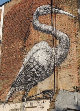

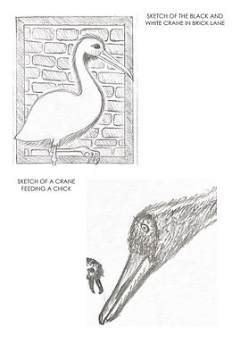
Brick Lane is mostly known for its street art and murals around the area, because of this, I decided to look at the different murals around Brick Lane and see what I could find. The biggest mural in the area is that of a crane on the side of a building, this was the inspiration behind my magazine cover because it can be recognised easily if people know the area whilst tourists will want to find out more about it inside the magazine issue. On the right hand side there are some sketches of cranes in different positions.
I tried to create some variations of the front cover illustration with different colours to see which colours compliment each other and what colours would look good in the front cover of the magazine.
The next thing on the list was the typography, this was a difficult for me at the time as I had to ensure that the typography on the front cover draws attention as this project was mainly about designing a nice front cover.
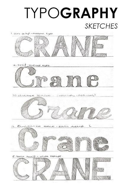

I tried experimenting how the name of the magazine would look in different typefaces in both 'sans serif' and 'serif' styles. On the left hand side I did some sketches of the desired typefaces that I thought would look good for a magazine cover, and on the right hand side are the digital typefaces that I was able to download and try out to see if they were good. I wanted to go for a sans serif typeface in the end because nowadays many magazine covers use those typefaces for the reason that it is modern and polished which allows the reader to understand what the magazine's name is. I felt these particular typefaces matched the magazine's style and tone of voice well as it was a travel issue for people who have not been in the area


Above are the different typefaces that can be found throughout the magazine. I chose a few typefaces that represent different tones and styles. At the time of this project, COVID-19 was at its peak which meant that many adverts were about the coronavirus, I wanted to include my own advert with about the coronavirus telling people to stay home during that time so I included an advert from the NHS and the London Coffee Festival. I used a typewriter typeface as it has a serious tone of voice and implemented uppercase lettering and full stops to create a serious feeling towards the reader.

These are the colours that had been used in the magazine, I was given a choice either to fill the inside of the magazine with dummy text or real text based on the research I did, because I was having trouble with the layout of the magazine pages, I decided it was best to fill some of the pages with dummy text and some of the pages with real text as I did a lot of the research myself. I also turned it into an interactive magazine because during that time in the project, I was learning about the interactivity tools on InDesign and thought that it would be fun putting some of those tools inside the magazine and turning it into a digital magazine, and as it was my first published magazine, some of the interactive buttons and animations works whereas some didn't.

