


Around the World in 12 Months - Travel Calendar
HND Level 5 Graphic Design - Final Major Project

For this project, we were given an open brief which allowed me to work on something I was passionate about. One of the many ideas I had was to create a calendar the size of a notebook which can help travellers schedule their trips and activities if they were travelling that month.
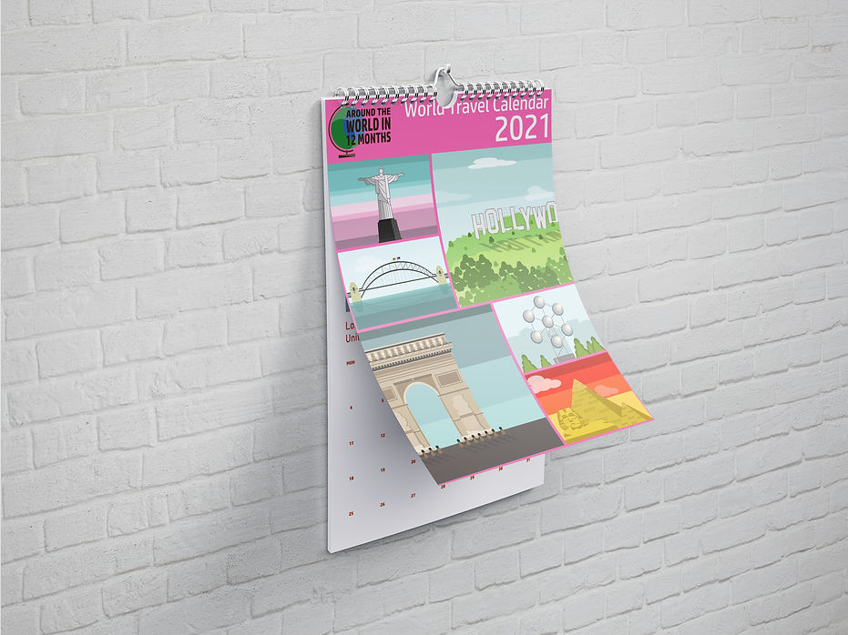
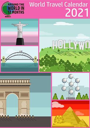_Front%20Cover.jpg)
FRONT COVER
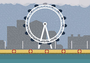
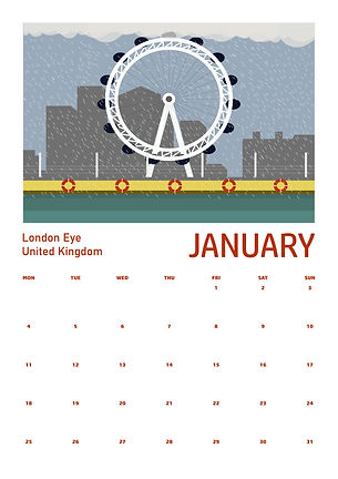_The%20London%20Eye.jpg)
MONTHLY PAGES
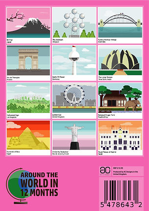_Back%20Cover.jpg)
BACK COVER
As this was a solo project, I was required to manage time well and organise the different tasks in order otherwise it could've become overwhelming for me. What I started with is taking a look at the different sizes of calendars that exist, this was important because it allowed me to create the right document sizes, I wanted to do a pocket calendar for travellers but towards the end it turned into an A4 wall calendar because I wanted to illustrations and the dates to be visible and clear which the A5 size was preventing me from doing.
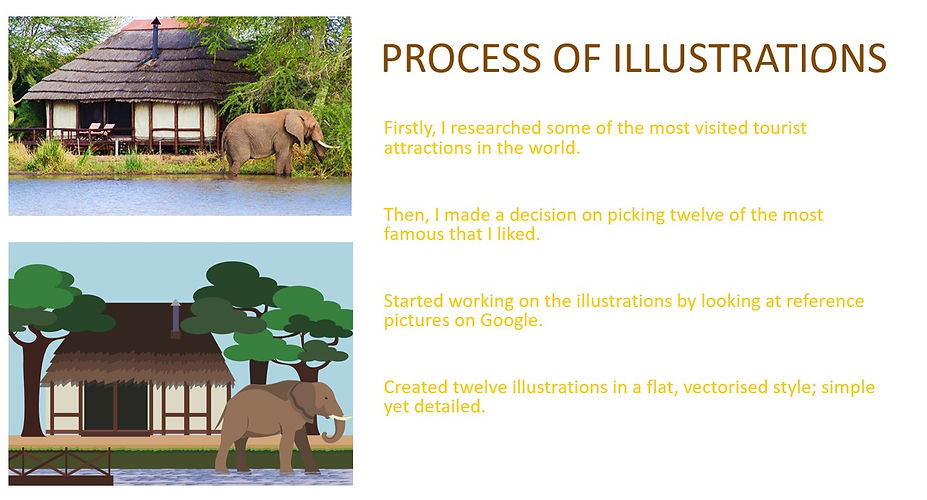
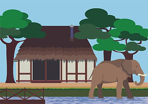
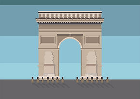
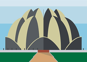
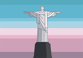
After this I wanted to create some illustrations to go with each page of the month. I researched some of the most famous tourist attractions visited by tourists around the world. I picked twelve of the best ones that I liked, saved the reference images from google and used them to create my own versions of the tourist attractions on Adobe Illustrations.
-01.jpg)
-07.jpg)
-03.jpg)
-10.jpg)
-09.jpg)
-12.jpg)
The illustration style was vectorised without too much detail so it stays minimalistic. I was happy with how the set turned out because the style stays consistent but the illustrations are different, obviously. I had made the skyscapes also minimal as I have used rectangles with different colours rather than gradients because that would defeat the purpose of create minimalistic vector illustrations.
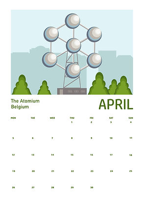_The%20Atomium.jpg)
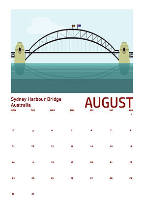_Sydney%20Harbour%20Bridge%20.jpg)
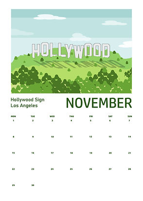_Hollywood%20Sign.jpg)
The next thing that I did was sort out the layout of my calendar, this was hard because there were a lot of different layouts so I just when with the most popular layout which was an image at the top and the dates below. Each date would have a certain amount of space so that the user can write something down in that space if they had an activity or event on that day. Between the dates and the illustration, I placed the names of the places and where they are located on the left hand side, and on the right, I placed the name of the month and each page was colour co-ordinated to give it some colour. I wanted the focus to be on the dates and the illustrations that is why I did not add any background colours on the page.
.jpg)
.jpg)
.jpg)
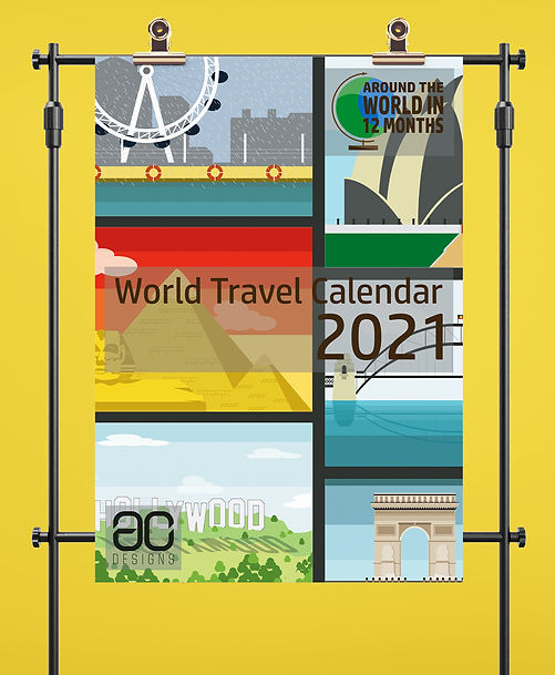
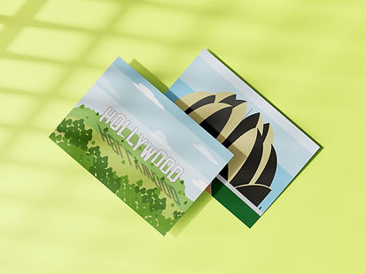
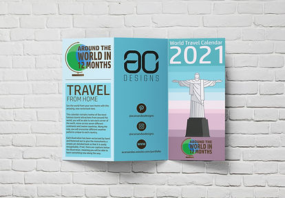
The next thing I worked on was creating all the extra content to help promote my calendar, for example, there were postcards, an A3 poster and an informative leaflet about the wall calendar. I created a mock-up of these to help picture the content and to create an authentic feel for the promotional content. Overall, I was happy with the content I produced for this project because I was still learning a lot about the tools that the Adobe Suite has to offer, looking back at this project now, I do feel like I could have done a lot better with the designs but at the time my knowledge was limited since it was only my second year in the course.